The Explorer allows you to view and manage your Saved Metrics, create new metrics from scratch, and add Out-of-the-box Metrics.
Saved Metrics
Advanced Billing Business Intelligence (BI) enables you to perform flexible analysis on your Advanced Billing data and data sent to Advanced Billing by creating metrics. Metrics run queries on your data based on selectable parameters and return a visualization of the query result. Advanced Billing BI offers 10 chart types with variants (e.g., stacked, grouped, percentage, etc.) Metrics can be saved and will appear on the Saved Metrics list. Saved Metrics can be easily added to a dashboard and securely shared with key stakeholders.
To help you get started, Advanced Billing Business Intelligence offers 26 out-of-the-box metrics that you can add to your list of Saved Metrics. Out-of-the-box metrics provide a great starting point and can be cloned and customized for additional granularity.
Add Out-of-the-Box Metrics
Out-of-the-box metrics can be added to your Saved Metrics list by navigating to the Explore tab and selecting “Add Out-of-the-box Metric”. A pop-up will appear with metrics sorted by category.
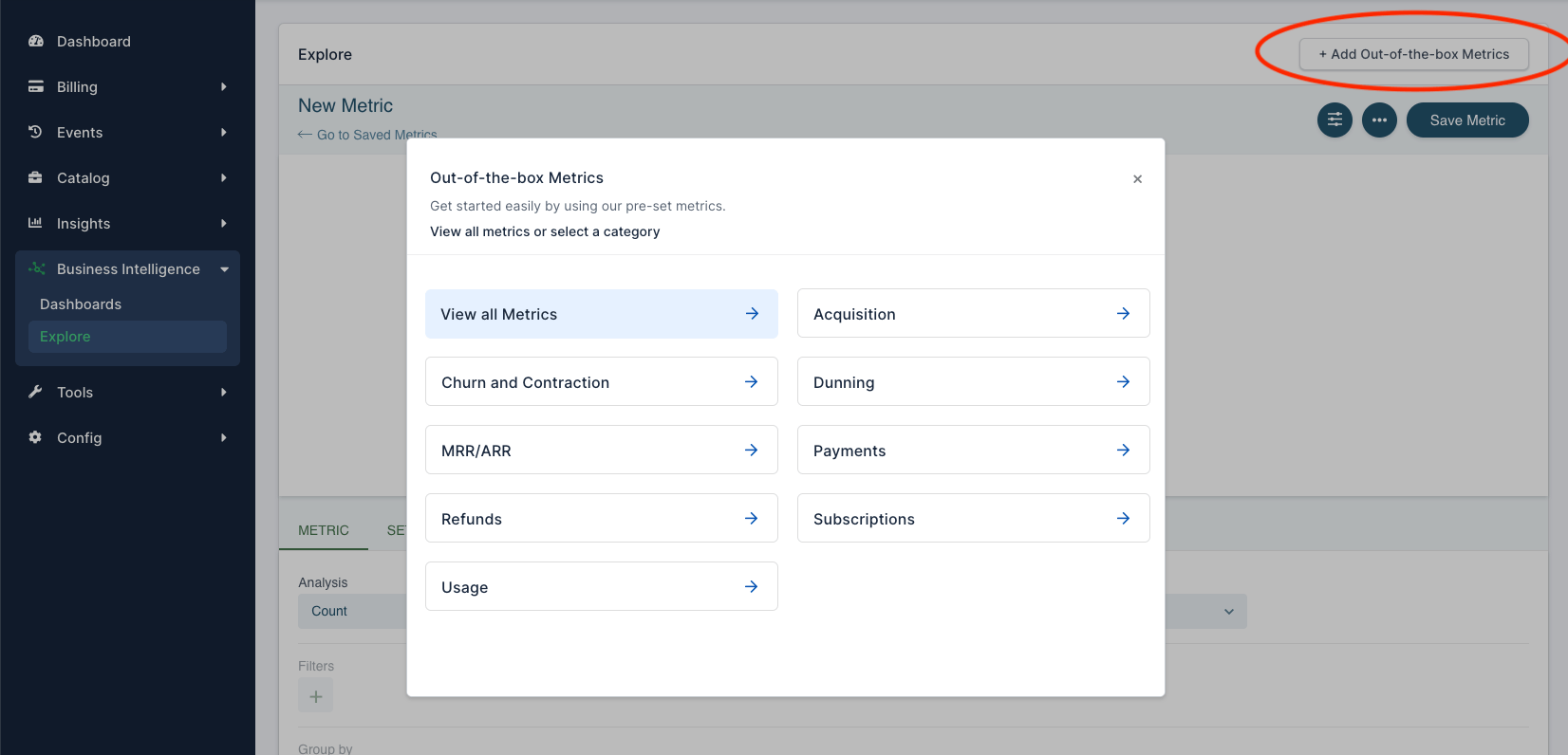
Out-of-the-box Metrics modal view
Choose a relevant category or ‘View all Metrics to see a list of available metrics, their definitions, and their calculations. Simply select ‘Add Metric’ and it will be added to your list of Saved Metrics.
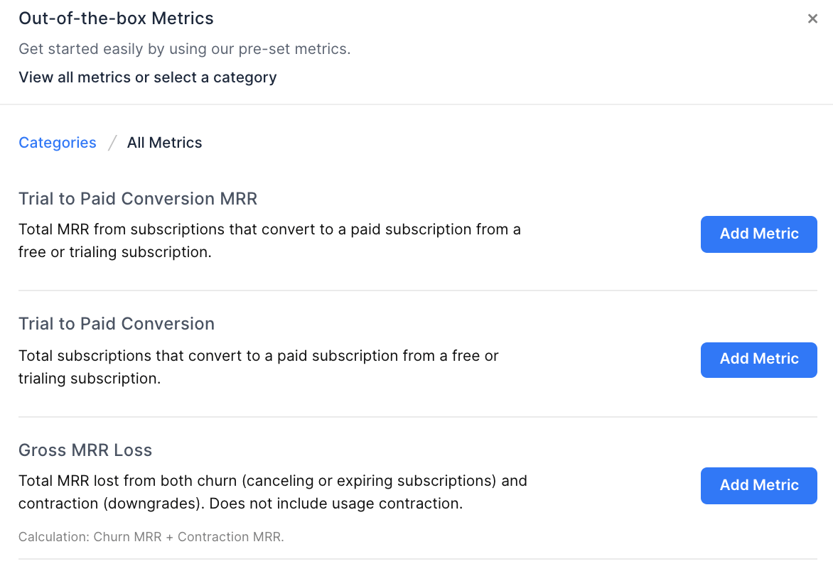
Out-of-the-box Metrics category modal view
See our Metrics documentation for a complete list of available Out-of-the-Box Metrics.
Clone and Customize an Out-of-the-box Metric
Out-of-the-box metrics that are added will appear on your Saved Metrics list. We’ve designed the predefined metrics to be high-level and we recommend cloning and customizing to achieve more granularity.
To do this, select the metric in the Saved Metrics list, select settings, and then select clone.
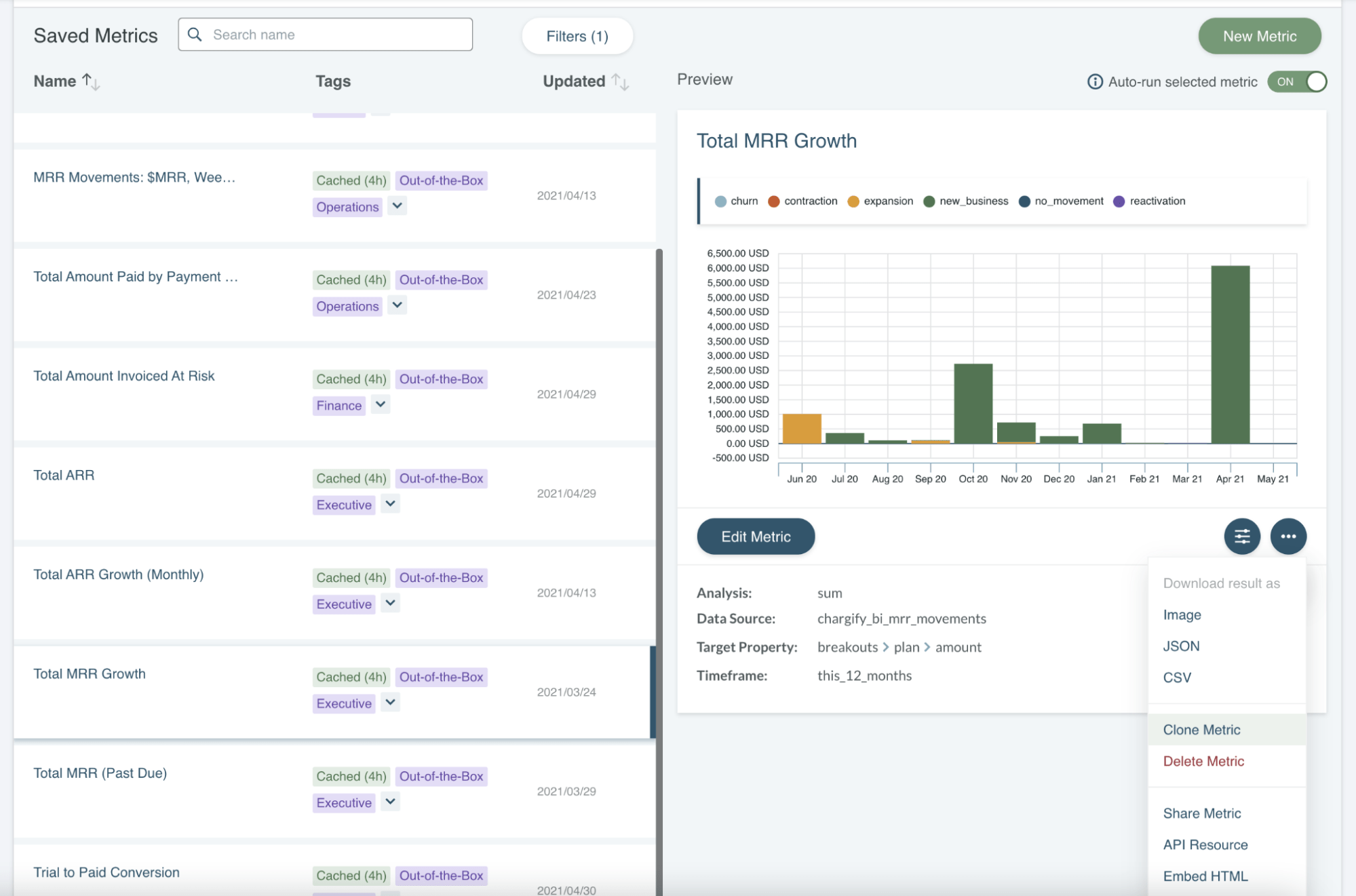
Saved Metrics list view with Metric preview
This will create a clone that has the same metric parameters. We cover all of the parameters that can be adjusted here.
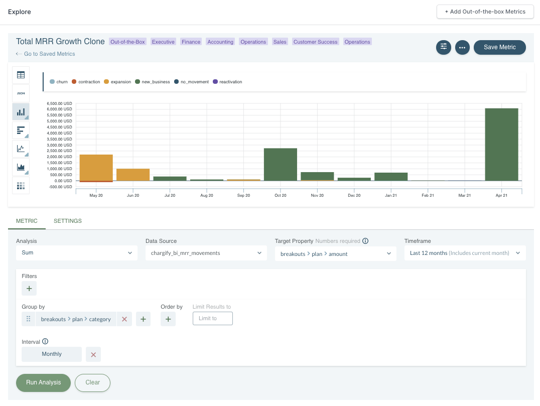
Metric details view
Creating a New Metric
The Explorer allows you to define query parameters and run custom analysis on your Advanced Billing data and data sent to Advanced Billing. There are 10 default data sources in Advanced Billing BI. Additional data can be streamed to Advanced Billing using Events-Based Billing, integrations, webhooks, and open-source Kafka connectors. The following example covers metric parameters in more detail.
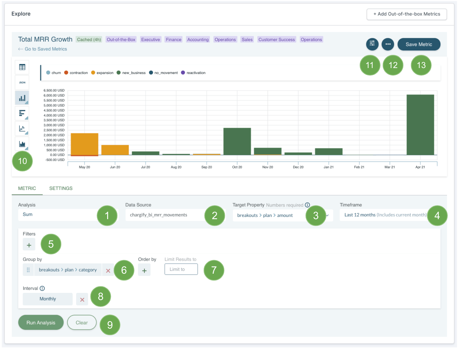
Metric detail / Metric tab
- Analysis - there are 12 analysis types for you to choose from. They are listed here.
- Data Source - all of the available data sources that you can perform analyses on are listed here.
- Target Property - the number of properties in a data set can vary from a few to as many as a thousand. The Target Property specifies which property to perform the selected analysis on.
- Timeframe - you can choose between Relative or Absolute time frames when extracting your data. When using a Relative timeframe, “this” 14 days means you are extracting data from the last 14 days including the current day.
- Filters - adding “Filters” allow you to refine the scope of your query. Only events that match the criteria will be included in the analysis.
- Group By - adding “Group By” properties allow you to view results categorically.
- Order By - adding “Order By” allows you to sort the results in ascending or descending order based on a target property. You can also specify a number to limit the results to.
- Interval - adding an “Interval” such as daily, weekly, or monthly, will set the frequency of the results within the given time frame such as daily for “this 14 days”.
- Run Analysis - run analysis to see the result of your metric, any time you make a change you need to click this to see the result of the change.
- Visualization Types - There are 12 different visualization types to choose from
- Metric Settings - to give the metric a name and add tags that can be used to filter the list view
- Actions - to delete or clone the metric
- Save Metric

Metric detail / Setting tab - Chart Title - adding a title to your chart that will appear everywhere the Saved Metric is used
- Chart Subtitle - adding a subtitle to your chart that will appear everywhere the Saved Metric is used
- Prefix - this can be used to add a prefix to the numeric values in your Saved Metric, for example USD for MRR fields
- Suffix - this can be used to add a prefix to the numeric values in your Saved Metric, for example, pcs for a quantity field
- Precision - this is used to set the number of decimals you want to display
- Calculate - this can be used to apply a calculation to a numeric value in your Saved Metric. For example, MRR in Cents can be converted to MRR in Dollars by dividing by 100.
Please note, when creating a metric from scratch, all numeric currency values are in cents (whole numbers) and will need to be converted using the “Calculate” option above to convert them to dollars.
Editing a Saved Metric
Selecting “Edit Metric” in the Saved Metrics view will open the Metric detail view where you will be able to edit and save your metric. Once you have clicked on Edit Metric you will have access to all the same options as when creating a metric from scratch, listed here.
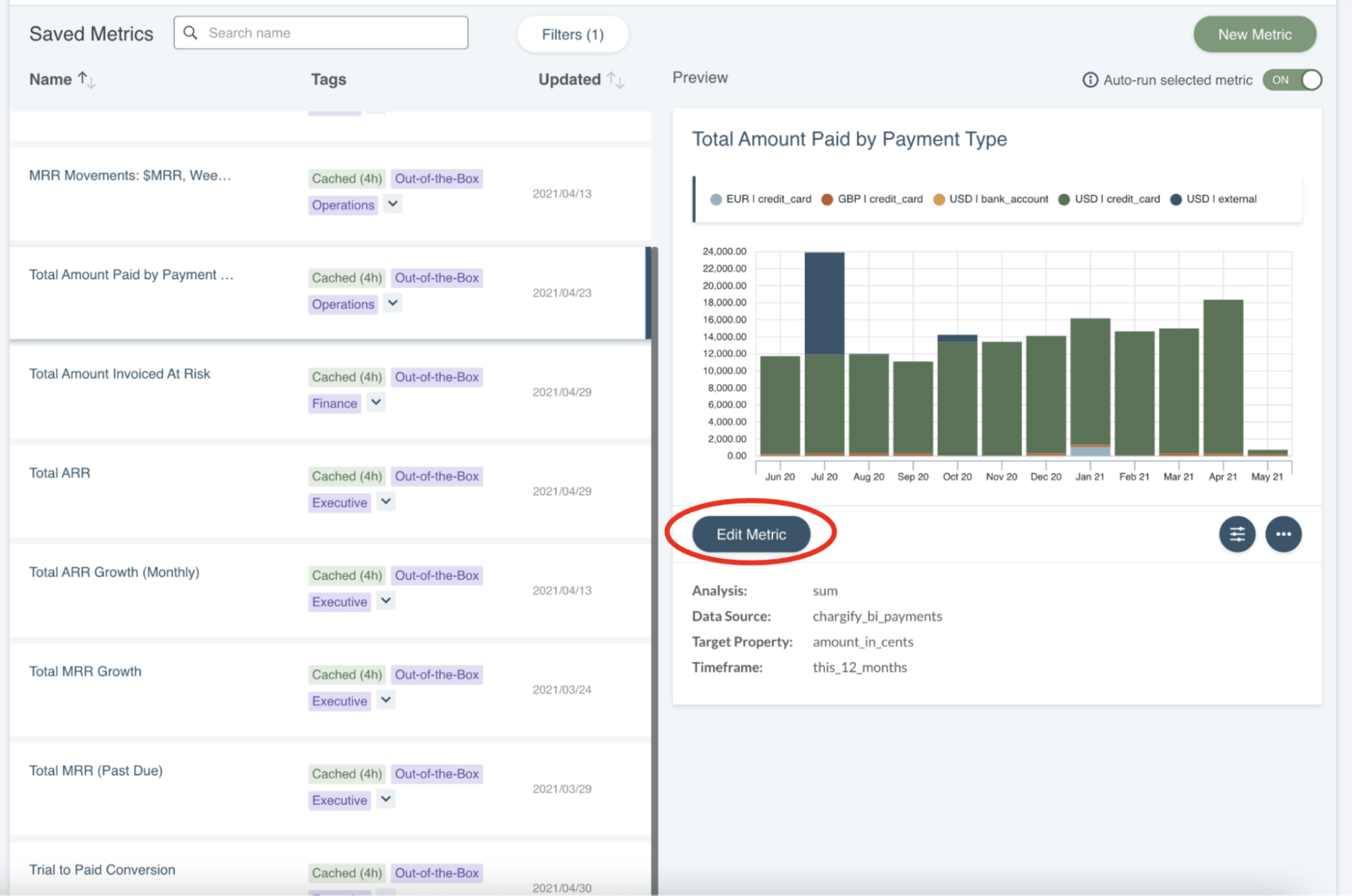
Saved Metrics list view with Metric Preview
Please note that editing a saved metric that is used on any dashboards will also update the dashboards.
Visualization Types
- Bar Chart - Bar chart (bar graph, column chart) is the most common approach to visualize amounts for different categories.
- Line Chart - Line chart shows how a given value changes over continuous intervals. It displays the series of data points (called markers) connected by lines segments.
- Area Chart - An area chart has the same construct as a line chart with added shading between the line and a baseline.
- Heatmap Chart - A heat map displays quantitative values for two or more sets of categories. It is commonly used to visualize hot spots within data sets. It helps to discover patterns and correlations. Due to its compact nature, it is often used with large sets of data. Heat maps are used to present the order of magnitude.
- Funnel Chart - Funnel Chart presents the phases of the process. It quickly shows the reduction of data in the sequence of steps. At each stage some users, events are lost. Funnel visualization is an easy way to identify the bottlenecks of the flow.
- Metric Chart - displays a single numeric metric result
- Pie Chart - The pie chart depicts values as slices of a circle.
- Donut - This type is functionally identical to a pie chart, however it has a blank center and can support multiple statistics at once.
- Choropleth - This visualization type plots your data on a map.
- Table - The table visualization organizes your metric result in a table.
Saved Metrics List
The Saved Metrics view gives you a central location to manage all of your Saved Metrics. To access this view, navigate to the ‘Explore’ tab and select ‘Go to Saved Metrics’ in the top, left-hand corner.
In this view, you can manage all of your Saved Metrics. Find what you are looking for quickly by sorting metrics alphabetically or by date, filtering based on user-defined tags, or searching by name. A detailed preview of your query including the visualization and information on the query parameters is available by clicking on a query. Finally, you can select the settings icon to perform a variety of actions on a query like cloning, deleting, sharing, and downloading.
Analysis Types
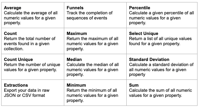
Metric analysis types
Data Sources
This is the list of all Advanced Billing data sources available to you for building metrics.