What is Dunning?
Please see the Introduction to Dunning for details about the options available to handle Dunning within Advanced Billing.
Revenue Retention Webinar
For a brief overview of what the Revenue Retention report offers, we recommend viewing an archived copy of our webinar that was showcased upon release of the feature. You can access the video here:
Using and Understanding Advanced Billing Dunning Analytics Reports
Your Dunning Analytics Reports are available from the “Insights” tab, within the “Revenue Retention” sub-tab.
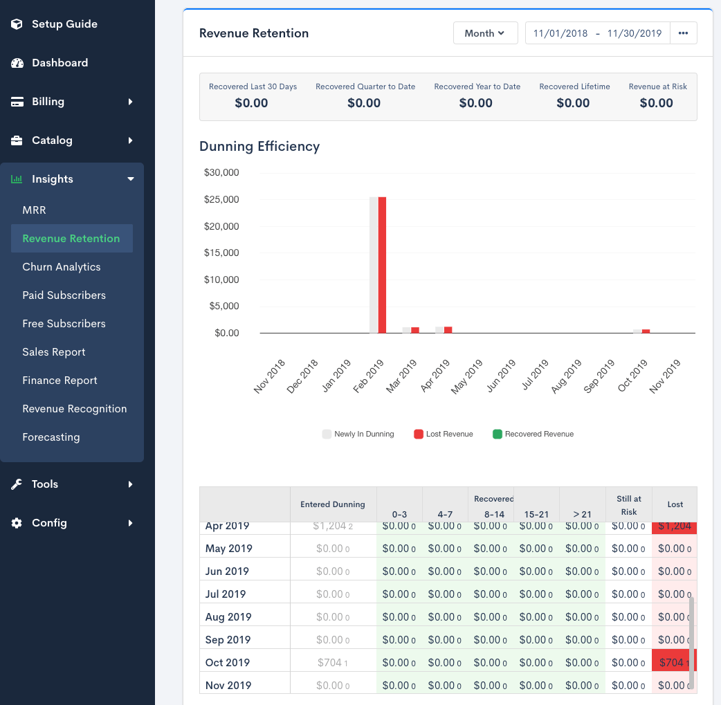
The Revenue Retention report is included under the Insights suite.
Dunning Efficiency Chart
The “Dunning Efficiency” chart breaks down your dunning activity by time period:
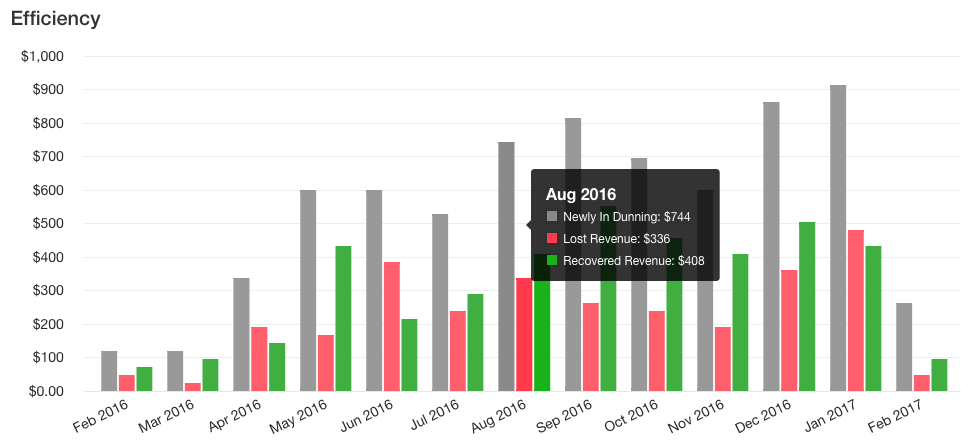
Each category is made up of the following data:
- Newly In Dunning: The amount of revenue at risk due to customers having entered dunning.
- Lost Revenue: Revenue that are now lost due to customers having entered dunning and either a) canceling their subscription while in dunning, or b) reaching the last step of your site’s configured dunning strategy without updating their payment profile, thus having their subscription automatically canceled.
- Recovered Revenue: Revenue that is now recovered due to a customer having successfully exited dunning due to a) updating their payment profile, or b) having their balance reset so their subscription returns to an “active” state.
Dunning Efficiency Table
The Dunning Efficiency table shows how long customers remained in dunning, in a given period, before the revenue represented by their subscription was either recovered, lost, or is still at risk.
Note that the period represented in the left-most column of that table is what drives the calculations for that row:

The Dunning Efficiency table denotes how long subscribers are staying in dunning and whether they are ultimately recovered.
In the above example the following is occurring for Jan 2017:
- 38 subscriptions entered dunning, representing $912 worth of revenue “at risk”
- $168 was recovered within 0-3 days (7 subscriptions)
- $192 within 4-7 days (8 subscriptions)
- $72 within 8-14 days (3 subscriptions)
No other revenue was recovered, none is still at risk, and $480 was lost (20 subscriptions).
The shades of each color in the Efficiency table represent the % that the cell’s value represents of the overall revenue at risk. The darker the color, the higher the percentage. The goal is to be able to infer, from a quick glance, where most of the revenue at risk in a given time period is falling: is it recovered quickly? Lost? Still at risk? If recovered, when does most of it get recovered?
Ideally, you want to see darker shades of green under the “0-3 Days” or “4-7 Days” columns, since that would mean most of your site’s revenue that enters dunning is recovered quickly.
You can also click on each of the cells (except those under the “Still at Risk” column) to view the customers that make up each number:
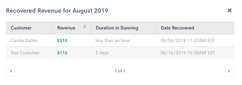
The Dunning Efficiency table will link to a list of all included subscribers when you click on a particular cell.
Revenue Still at Risk
The “Revenue Still at Risk” chart is a graph is your site’s historical “revenue still at risk” at the end of each time period (the default is “month”).
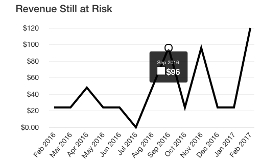
The "Revenue Still at Risk" chart
Customers in Dunning
The “Customers in Dunning” table lists out all customers currently in dunning, sortable by the “revenue at risk” their subscriptions represent, or how long they’ve been in dunning. Clicking on the customer’s name will take you to their subscription page within the Advanced Billing application. Additionally, click “View Details” for a quick link to the subscriptions tab filtered to these past due subscribers.
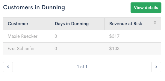
This table lists all subscriptions that are currently past due.